How To Add Animated Gradient Backgrounds In Squarespace
Ian Forrest's CSS Gradient Animator tool.
In an earlier post, we covered adding CSS background patterns in Squarespace. I've also posted on adding a color gradient border with CSS, changing Squarespace's announcement bar's background to a color gradient. Now it's time to play with a different kind of background: animated gradients.
What are animated gradients?
Animated color gradients are gradients that shift along a background according to a defined formula, either infinitely or for a specified number of iterations.
(Note: sometimes color gradients are called ombré, though that refers to gradations within the same color family.)
Done properly, animated gradients can add a nice touch to an otherwise unremarkable page, or even completely alter how it's perceived. Check out the footer on this Squarespace website by Pocketknife. It's just a contact form with some CSS styling. But the sweeping animated gradient, which utilizes the color palette from the image at the top of the index page, gives it a cool, sophisticated look. I use an animated color gradient as a background for a section on the Marksmen Studio homepage.
Adding an animated gradient background is similar to adding a gradient background that is not animated, except that we have to throw in some extra elements. The main ones are the @keyframes rule to govern the animation, the angles, and the background size.
You'll need to identify the page or block you want to add the animated color gradient to. It works exactly the same as I outlined in the earlier post on CSS background patterns: just put the code in between the curly brackets that follow the page or block identifier. If, for example, you have an index page section in the Brine template named "grandma", the code would look like this:
#grandma {
CODE HERE
}
In most cases you'll add CSS to your Squarespace site by going to Design > Custom CSS in the Style Editor.
Recommendation: Match The Color Palette
I recommend choosing colors that match or complement the color palette you use on your site. That way you reinforce your brand and give the site a sense of coherence. Be wary of using too many colors unless you have a specific idea. Just two well-chosen colors suffice to add some drama, while preserving the sense that you have things under control. On the other hand, if you're going for big, popping and dramatic, this might be a good time to go for it.
Also, think about where the colors you're choosing fall on the color spectrum. Generally speaking, you'll want the colors in the middle of the gradient (if there are more than two colors) to lie in between the ones on the outside on the color spectrum. That way there is a sense of a coherent sweep, instead of just a confusing mess of colors. Let's say the colors are orange, yellow, and red. For your gradient you would want the color order to be yellow, orange, and red.
Add The Animation To The Color Gradient
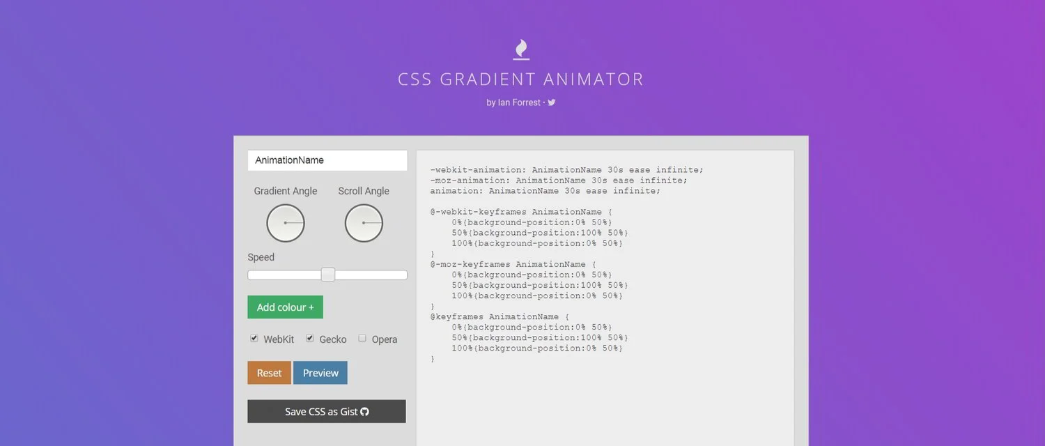
Ian Forrest's CSS Gradient Animator is an excellent tool that should be all you need. Simply choose the colors you want, plus gradient angle and scroll angle.
The gradient and scroll angles are worth playing with, but don't worry about them too much. Just get the general direction right: top, bottom, right, left. The length and type of animation will have more of an effect.
The tool automatically sets the @keyframes rule, so you don't need to worry about that.
You'll see that the tool presets the duration of the animation to 30s, i.e., thirty seconds, with "ease" as the animation timing function, and "infinite" as the animation iteration count. These work well as a standard setting. But don't feel you need to be limited to them. Just go into the code and change them to what you want.
Maybe you'd like the animation to last for a while, then finally settle on the last gradient. In that case, replace "infinite" with the number of iterations you want.
Thirty seconds too slow-moving for you? Change the number of seconds. If you choose a very short duration of less than five seconds, you'll get some pretty weird effects, depending on what you choose for the gradient and scroll angles.
Then there is the animation timing function. I recommend sticking with the "linear" or "ease" timing function if you just want to choose something that looks pretty good. But there are a lot more to choose from, and you can get funky with it.
Getting Gradients Good
Take a look at a few animated gradients we will then show the code for by clicking here.
Pretty neat, huh? All of these animated gradients were applied to simple text blocks that were identified using the Chrome block identifier for Squarespace. They all use just two colors.
The code for the last background is:
background: linear-gradient(270deg, #e32121, #2004e3);
background-size: 200% 200%;
-webkit-animation: AnimationName 10s cubic-bezier (0.68, 0.55, 0.265, 1) infinite;
-moz-animation: AnimationName 10s cubic-bezier (0.68, 0.55, 0.265, 1) infinite;
animation: AnimationName 10s cubic-bezier (0.68, 0.55, 0.265, 1) infinite;
Plus the keyframes rule:
@-webkit-keyframes AnimationName {
0%{background-position:0% 49%}
50%{background-position:100% 52%}
100%{background-position:0% 49%}
}
@-moz-keyframes AnimationName {
0%{background-position:0% 49%}
50%{background-position:100% 52%}
100%{background-position:0% 49%}
}
@keyframes AnimationName {
0%{background-position:0% 49%}
50%{background-position:100% 52%}
100%{background-position:0% 49%}
}
It uses the cubic bezier timing function, which defines a variable speed from beginning to end. The cool kids are fond of cubic bezier, and it's worth reading more about it and the other CSS3 timing functions.
The first two backgrounds above are at 50% so you get a sense of background size and the linear and ease timing functions. You'll want a background size larger than 100% (and probably greater than 200% for most uses) or else you'll see the background itself. But note the different ways the linear and ease functions work in the examples above.
Just Playing Around
Obviously you get a lot of different effects with these. Just play around with them to find what you like. If you see a website using an animated gradient you admire, just right click > Inspect in Chrome and poke around in the CSS. You should be able to find the parameters pretty easily. That can give you some guidelines for how folks are using these and what actually works well. But you don't need to be limited to any sort of standard. With a bit of creativity and luck, you'll manage to create something that will set you and your project apart in a dramatic way.
Want To See More Squarespace Hacks?
From background patterns to fun with fonts. From animated gradients to getting that little scroll indicator in the Brine family of templates to bounce. Check out custom CSS tricks and other code hacks that will help you design a better Squarespace website.